Solar Production
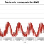


Related to my previous post, here are a few graphs related to solar energy production over the last 4 year. Most of this data is from my old system in the house I sold last year. It was a 10.8kw system using 34 320w panels. The new system just installed on the new house is a 53 panel 380W system with 20.2kw TAP.
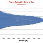
The power output by time of day is interesting in that it clearly shows the effects of angle of the sun. Peak power across all 4 years tends to happen around 1pm, but part of that is certainly due to the particular orientation of the panel system.
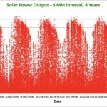
The red graph of power output (not total energy) is interesting in showing how cloudy a complete day was. During some of the winter weeks power output never grew above 2k, while in other spring and fall days you see the average being pretty low but lots of occasional higher power intervals. The summer peaks are very obvious.
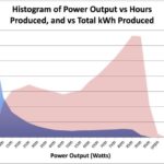
The Histogram of power output is the result of making a histogram the 5 min power averages into buckets (500w wide). The blue shows the number of hours the system operating in that range (excluding the 0 range). Most number of hours in the 0-500 range which would be very cloudy segments, and pretty flat relative values for parts above 3000w. The second pink area shows how many total kWh (Energy) were generated at a given power level. That shows how much of the total power generation occurs during the peak output areas even though they don’t represent the largest time segment.
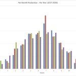
Production by month has a shape you would expect. Almost 7MWh produced in Jul, and less than 1MWh in Jan.
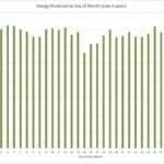
Production by day of the month is just something fun to look at. There isn’t any particular root behind the variance as most of the total solar factors have trends that are not related to particular day number. Of course the dip in day 31 is just due to the uniqueness of the Julian calendar. Solar output is directly correlated to cloud cover, so it would indicated for no discernible reason the 15th of each month was slightly more cloudy on average.
This data is of course specific to a solar system in the Pacific Northwest, and Portland in particular. However is would be representative of a typical system in those conditions, as the southern exposure of this system was very good, clear from obstruction, and consistent over the 4 years.