Data


No doubt most of my friends are aware that I’m a bit of a data enthusiast. You never know when a good dataset will answer some obscure question.
I have been keeping track of my utility usage for all of my adult life, just out of curiosity. (as one does). I recently updated my database with the data from the recent move. I now have 26 years of continuous accurate data about electricity, gas, cable, telecom, water, and garbage spend.
Each graph has a short explanation attached. There are a few interesting tidbits from this cycle – I am at almost $100,000 of spend for electricity over the last 26 years, and sometime in 2022 I should pass over the 1GWH of total electricity usage. Of that 1GWH, 46MWH were solar generated. 1GWH represents the maximum output of a Chernobly reactor for 1 hour as an interesting sidenote. Overall power usage is quite cyclic due to natural gas heat vs electric AC.
My single largest monthly usage is a bit of a fluke at 23.178 Mwh. That is a lot of power for one month, given the average US household use about 10 Mwh per year. The reason was the electric temporary coil heat that was running at the new house to help dry the drywall, which was very inefficient.
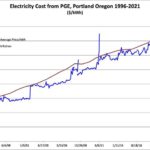
The cost per kWh is an interesting graph, starting at around 6c, and growing to the current 13-14c effective. That price reflects the actual cost of the power I used, including meter fees, etc, so it is a good representation of the practical expense. There is also a graph that factors in the solar power produced, which reduces the effective cost of my power from PGE, but does not take into account the capitol cost.