Power

It wouldn’t be a good Sunday if I didn’t have at least one piece of interesting data to share. My wife claims that when she mentions these graphs to her friends they seem to think I am weird. I think they are just jealous.
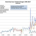
Today I have graphs of my power usage (electricity) from early 1996 to today. The right side of the first chart has 4 lines, one for each meter at my current place plus a summation of those meters.
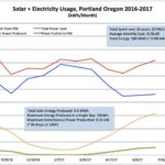
The third graphs shows the effect of the solar system I installed late last summer. I am still on the rising side of the solar output this summer, and it would be cool if I was able to get to 50% of my total power usage via solar. Power pushed back to the grid is also much higher in the summer months as the peak power output during the day is so high.
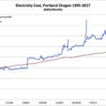
The fourth graph shows the average cost/kWh I actually paid over time, and compared to inflation. We have some of the cheapest power in the nation, but that price is still outpacing inflation a bit.
It is also interesting that my total power usage so far has been 588 MWh, while the energy equivalent of my total natural gas usage was a surprisingly close 544 MHw. That natural gas however was only $20k, while this electricity was almost $60k.