Graph
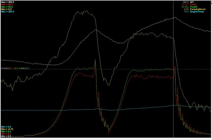
It is surprising what can be seen in a single simple graph, and what questions it can lead to. Look at the attached picture, a simple graph from a simple tool. It shows an acceleration in 2nd and 3rd gear on my drive to work today. The blue line near the bottom is the air temperature after the intercooler. The white line is the temperature before the intercooler and right after the turbo. The red line is pressure after the intercooler, right before the throttle body, and the green is the pressure right at the turbo outlet. Finally the yellow line is the cars acceleration in g’s.
From the start, the contrast from the white to the blue line shows the extreme effect of an intercooler. Life without an intercooler would be a different, more disappointing life. At 264 degrees F the air is cooled to 70F before heading to the engine. Thermodynamics is a wonderful thing.
The red and green lines shows the difference between what the turbocharger is producing, and what is making it to the engine. That is an almost 4psi difference across the intercooler, and some of that change in pressure is the result of the significant cooling imparted on the air by the intercooler. You can see the downward slope of the red line as the temperature differential increases.
The end of each gear has a few interesting properties. You can see the effect of the closing of the throttle by the nearly 6 psi spike right before the throttle plate as it is closed. The slope of both the red and green lines right after that point are almost perfectly aligned. This is with a system of piping and intercooling measuring in the feet, yet the latency is nearly zero. On the downslope you can see the oscillations caused by air bouncing off the throttle plate and reflecting back to the intercooler, and perhaps even back to the compressor cover. If you took that little section of the graph and did an FFT you could measure the frequency of that oscillations and correlate it to the size and temperature of the tubing.
My shifting clearing sucks, as you can see the car actually slows down between shifts. Acceleration in 2nd is higher than in 3rd, and that ratio will be close to the actual gear ratio difference, plus the effects of drag. The shape of the yellow curves are a proxy for the shape of the torque curve of the engine, and you can see the slight fallloff at higher rpm.
The noise is something else to be investigated. Are those pressure variations real? If I overlayed the duty cycle of the wastegate, would they have an obvious interaction?
Lots of questions you can ask yourself, and lots of things to learn to explain something as simple as just a few lines.